Developers like dark themes. When looking at a screen all day (or rather, night) long, a pale white background with black text is an eyesore. Many software engineers prefer to use a dark theme with lower contrast colors in their code editors, and many tools started shipping dark visuals as default in the last few years.
I fall into that group as well and have been using these themes for so long that I can't even recall when I joined the dark side. I started to like these dark themes a lot and find them more visually pleasing, appearing more... Professional. To reflect this, I wanted to give my website – this website – dark visuals as well.
This isn't always a success. On some screens or in some light conditions the dark theme can be difficult to read, and some just prefer a paper-like background color anyway. I decided to create a dark/light mode toggle to please everyone.
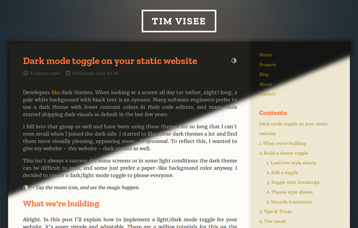
🌓 — Tap the moon icon, and see the magic happen.
What we're building
Alright. In this post I'll explain how to implement a light/dark mode toggle for your website, it's super simple and adaptable. There are a million tutorials for this on the Internet already, but here is my take on it in some detail with a few tips.
This will use and support:
- toggle theme using a button with smooth transitions
- remember chosen theme on a device, no flickering on page load
- simple & effective to implement, works on static HTML pages
- style sheet per color theme, keep it maintainable with SCSS variables
Continue to the next section for the implementation, or skip to The result just for the result.
Build a theme toggle
"How is this be implemented?" I hear you ask. Well, it's quite simple.
Because we're working with a static HTML website, theme selection must be done on the client. We'll use two style sheets (each for a different color scheme), and some simple JavaScript to toggle between these. The user preference will be remembered across visits.
Load two style sheets
First off, load two style sheets inside the <head> block of your website
which replaces the existing style sheet you might have in your template.
Just link both to your existing sheet for now. Assign an id to easily
reference them from JavaScript, choose style-light and style-dark. The
latter of the two links gets the disabled attribute to disable it by default.
They won't do anything yet, but this is to prepare for the toggle we'll build
next.
I'm using /site.css, which makes the imports look like this:
<link id="style-light" rel="stylesheet" href="/site.css" />
<link id="style-dark" disabled rel="stylesheet" href="/site.css" />
Add a toggle
Now we'll create the toggle. After that, we can finalize and iteratively experiment with a new color scheme.
Put an element that will act as toggle somewhere on your website where
it's easily accessible. It should invoke the theme_toggle() function when
clicked which we'll set up next. On my website it's a contrast icon located
next to the page title, check it out. Though it can be anything, I recommend
to use an anchor, like this:
<a href="#" onclick="theme_toggle(); return false;">🌓</a>
Toggle with JavaScript
Create a new JavaScript file, let's call it theme.js. We need a function
theme_set to set the theme to light/dark, and theme_toggle which toggles
the theme. This will toggle the disabled state for both style sheets
depending on a truthy parameter, and stores the preference as well in the
persistent localStorage JavaScript store on the client. The toggle function
queries the current state and sets the theme by negating it. It looks like
this:
function theme_set(toggled) {
    document.getElementById('style-light').disabled = toggled;
    document.getElementById('style-dark').disabled = !toggled;
    localStorage.setItem('theme-toggled', toggled ? '1' : '');
}

function theme_toggle() {
    theme_set(!document.getElementById('style-light').disabled);
}
To restore the user preference we need to set the theme on page load, based on the stored value. Append the following line for this:
theme_set(localStorage.getItem('theme-toggled'));
To use this, load the script in the <head> block of your template
after the style sheets, like this:
<script src="/theme.js" type="text/javascript"></script>
Theme style sheets
The toggle button is functional now, but you won't see anything change yet. We'll look at creating a second style sheet with alternative colors now.
Generally speaking, the only thing that differs between these sheets will be
colors. I highly recommend using SCSS as a
CSS preprocessor for this to allow the usage of color
variables, for easy theme variant creation. This guide won't cover
installation or usage of SCSS, though
some static site generators such as Zola have built-in support for
this. I'll show how I've configured my colors for my template, but you can
skip this section and use two raw CSS files as well.
Create a _colors_light.scss and _colors_dark.scss file. (This site
uses Zola, so I plase these in /sass/ for automatic processing.)
Both should look similar to this, but having configured colors you choose for
your respective themes:
/* File: _colors_light.scss */
$color-text: #282828;
$color-background: #fcfbf7;
$color-border: darken($color-background, 50%);
Moved all styles (used in any color variant) to _site.scss, and used the
color variables from above to adapt to the selected theme:
/* File: _site.scss */
body {
  color: $color-text;
  background-color: $color-background;
}
Then create a site_light.scss and site_dark.scss sheet as the base,
importing their respective color configuration and the shared site styles.
/* File: site_light.scss */
@import "_colors_light";
@import "_site";
After processing these, you've created both a site_light.css and
site_dark.css sheet. And yeah, it was that simple to keep it maintainable.
Be sure to adapt the style sheet links in your template to the paths these new
sheets are located at.
Awesome! Your toggle should now work, and the preference should be remembered across page reloads. Now take the time to tweak the color variants.
Smooth transitions
Once you're settled with a second color scheme and everything works, you can enable smooth transitioning between the two themes. We'll use CSS transitions for this, which are awesome because they're simple and performant.
In your shared styles, you need to configure what CSS properties will smoothly
transition when changed. Imagine our _site.scss sheet from before, to
transition all properties that use variables we'll modify it to add the
transition property like this:
/* File: _site.scss */
body {
  color: $color-text;
  background-color: $color-background;
  transition: color 0.2s ease-in-out,
      background-color 0.2s ease-in-out;
}
It will take some work to transition every dynamic property on your site, but the result is great. Be sure to read the CSS transition documentation on MDN, because there's a lot you can tweak and configure.
Hurray! That's it, yes it was that simple. CSS is awesome for this as it doesn't require changes to the body of your website except for some imports. Now you can publish your freshened website and profit.
Tips & Tricks
You can modify the style sheet imports and script to use dark colors by default,
like on this website. Set the light scheme to be disabled by default, and
tweak the script.
You might want to leave your existing style sheet as-is, and just use a second
sheet to override colors in the main sheet. Simply modify the script to only
toggle the disabled state for the overriding sheet, and query the overriding
sheet instead in the theme_toggle function.
This isn't necessarily for light/dark themes and works perfectly fine for other color combinations as well.
If desired, you could implement even more themes with a more advanced theme toggling script implementation.
For additional inspiration you can take a look at styles for this website.
The result
To recap, here is an overview of what the changes should look like.
Your templates <head> should contain something like:
<head>
  <!-- snip --->
  <link id="style-light" rel="stylesheet" href="/site_light.css" />
  <link id="style-dark" disabled rel="stylesheet" href="/site_dark.css" />

  <script src="/theme.js"></script>
  <!-- snip --->
</head>
And your theme.js file will look like:
// File: theme.js

/**
 * Set and apply the normal or toggled theme.
 *
 * @param toggled Truthy value to show toggled, normal otherwise.
 */
function theme_set(toggled) {
    document.getElementById('style-light').disabled = toggled;
    document.getElementById('style-dark').disabled = !toggled;
    localStorage.setItem('theme-toggled', toggled ? '1' : '');
}

/**
 * Toggle the current theme.
 */
function theme_toggle() {
    theme_set(!document.getElementById('style-light').disabled);
}

// Apply selected theme, stored in localStorage item
theme_set(localStorage.getItem('theme-toggled'));
Along with your custom site_{light,dark}.css sheets, this is all you need.
As always: Hope this helps! :wq